Work / Brand & campaign
Simply Alone Studios
A hoodie built around one quiet wordmark, and the campaign that had to carry both a product and a reason for it to exist.
- Year
- 2024
- Services
- Brand identity, Campaign, Apparel graphics, Art direction
- Deliverables
- Hoodie graphics, campaign, product and cause messaging
The graphic is held deliberately small. A stacked wordmark with a rule under it, sized and placed so it reads as a garment label rather than something shouting across a room.
The lockup does its work with weight rather than scale: a heavy sans for the name, a lighter cut for the sub-line, and a year set in script running through both. Three weights in a graphic barely six inches wide, which is what keeps it legible without getting louder.
The campaign had a harder job. The drop raises money for suicide prevention programmes, so every piece has to sell a sixteen ounce hoodie and say something true at the same time, without letting either one cheapen the other.
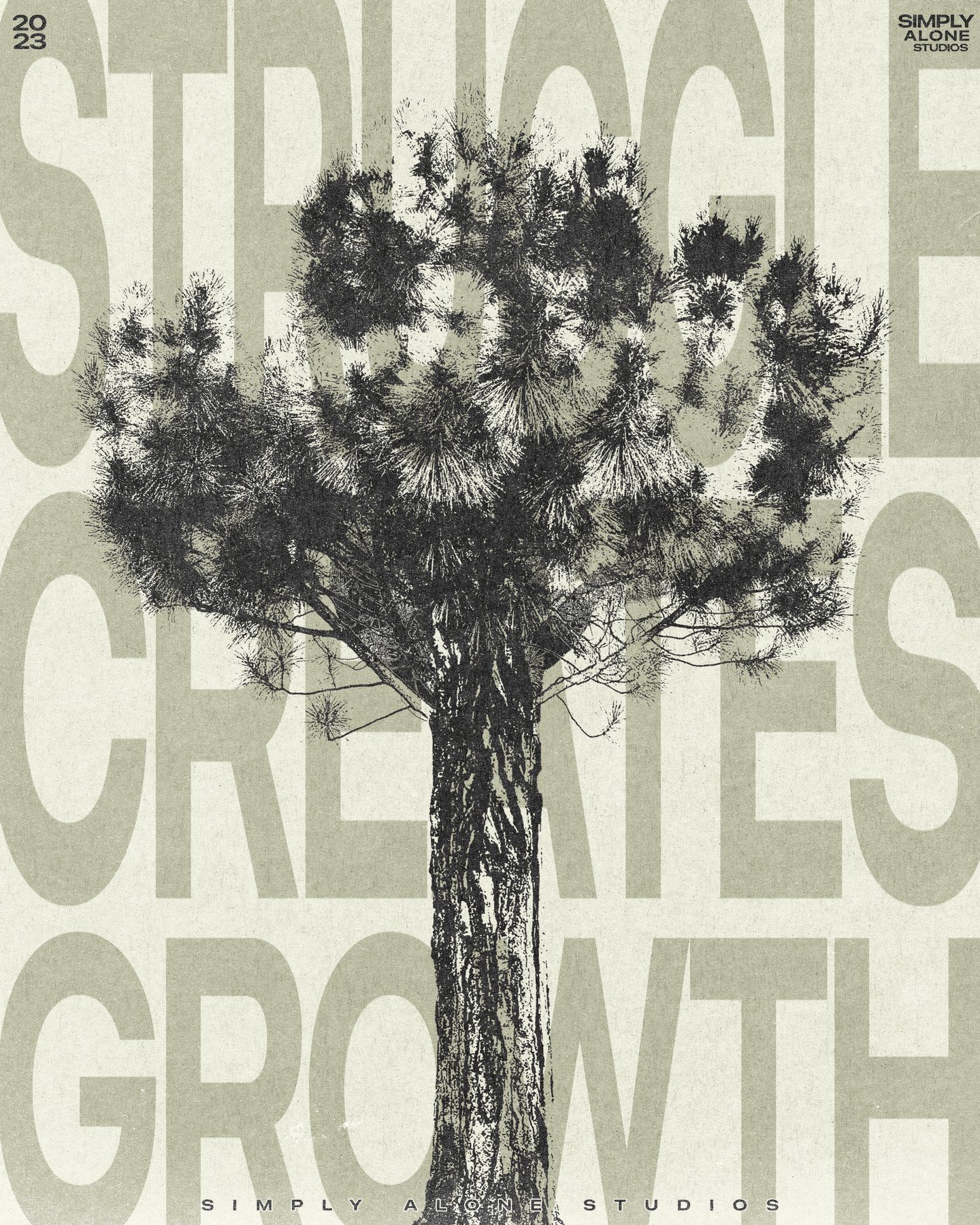
The answer was to separate the two jobs rather than blend them. The product frames do product work, plainly: the weight of the fabric, the price, the free shipping, callouts pointing at what you are actually buying. The message frames stay quiet and give the cause its own room. Struggle creates growth set around a bare tree. A beautiful world under a concrete underpass. Nothing is dressed up as more than it is.
“Sell the hoodie plainly. Give the reason its own room. Never let one dress up the other.”
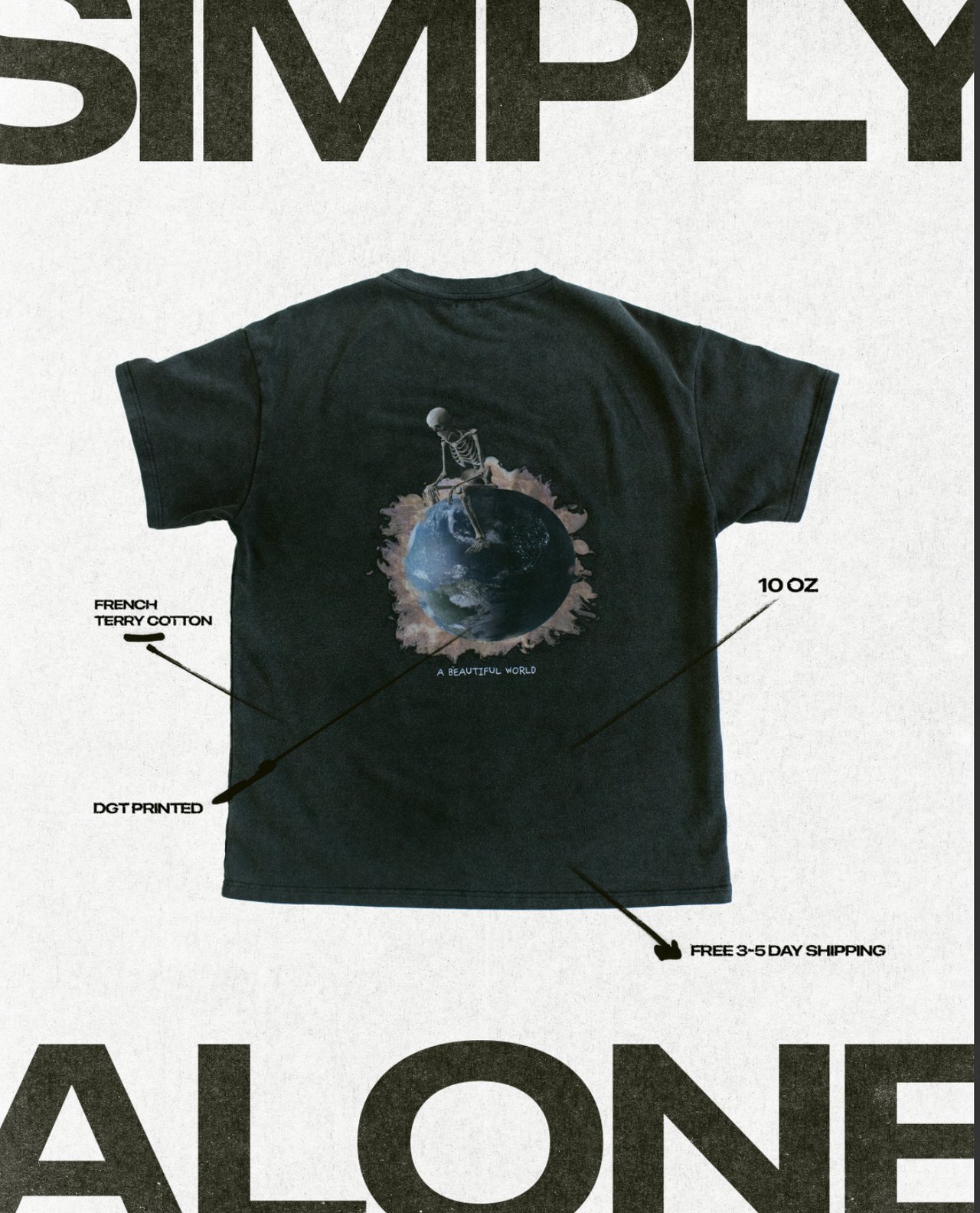
Fig. 01 | Product frame, tee
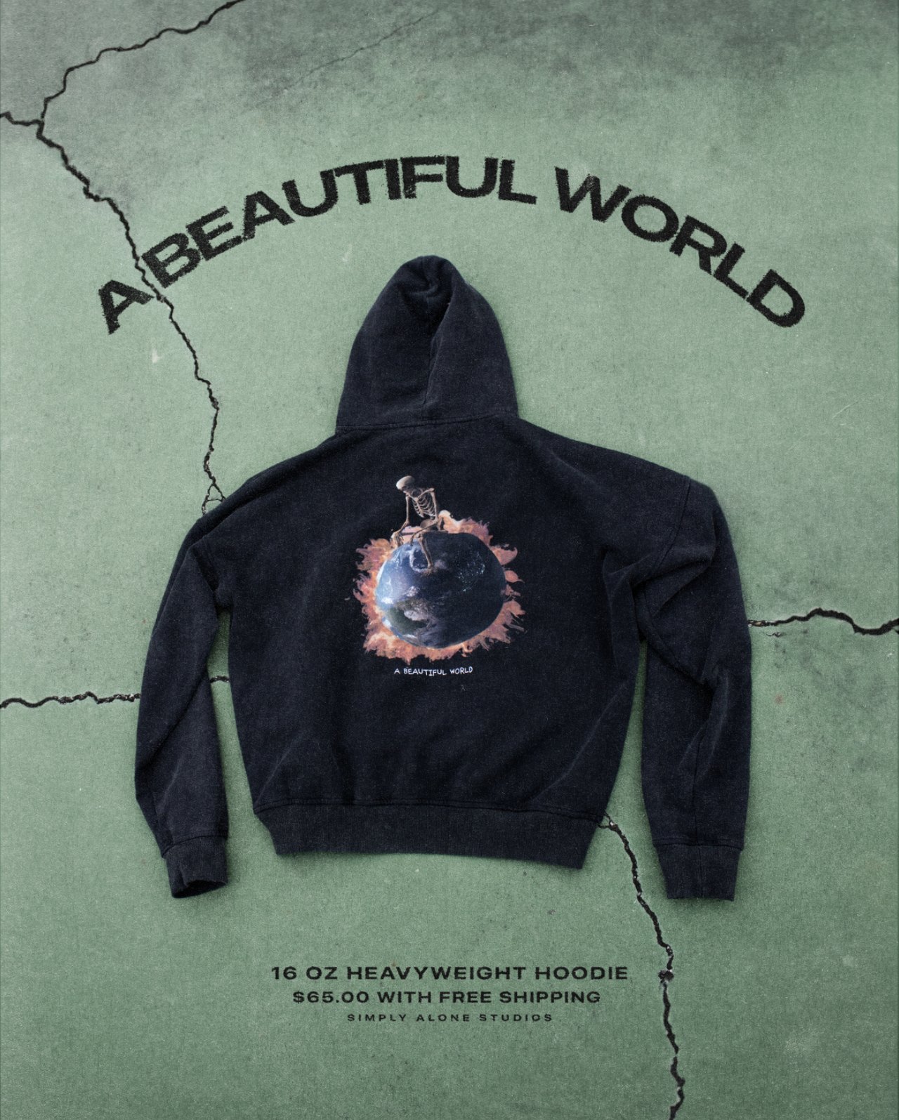
Fig. 02 | Product frame, hoodie
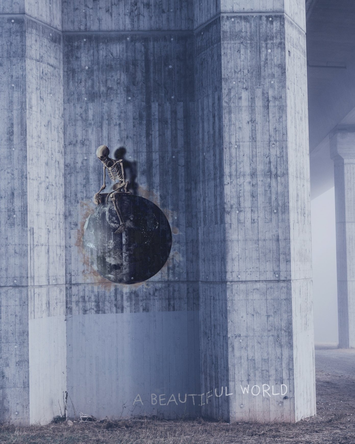
Fig. 03 | Campaign
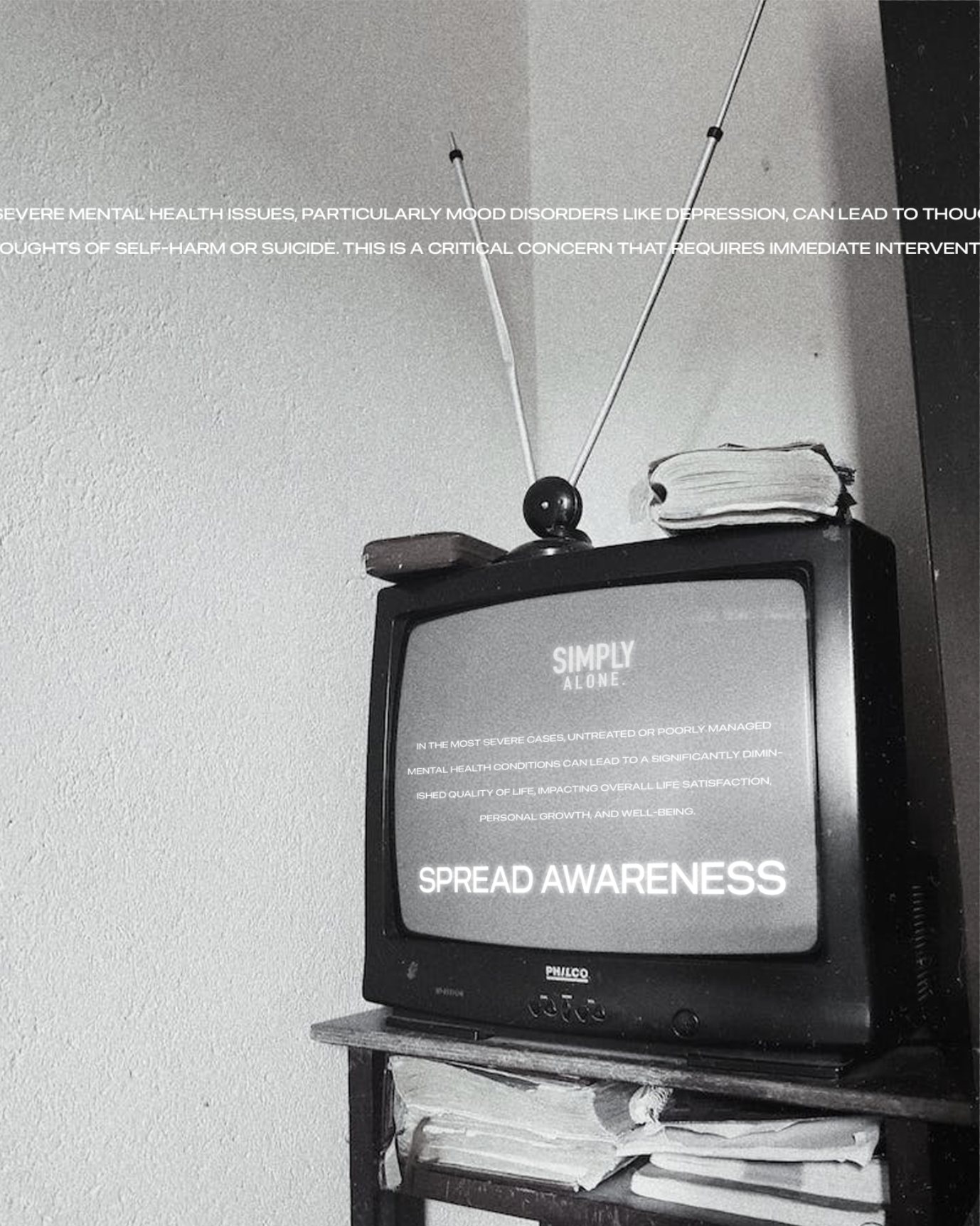
Fig. 04 | Awareness frame
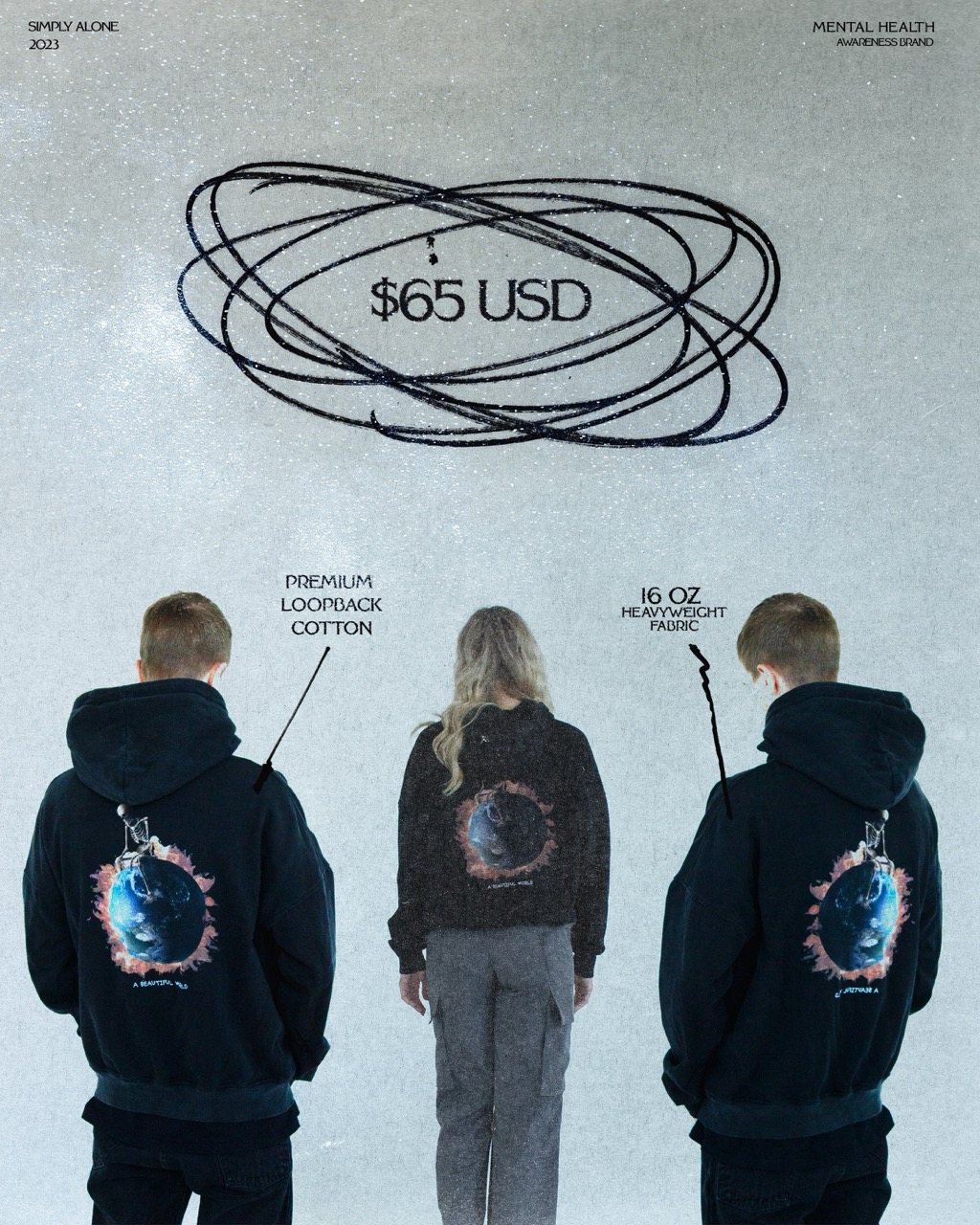
Fig. 05 | Specification frame
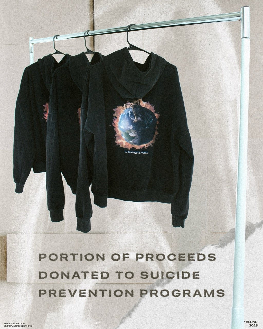
Fig. 06 | Cause frame
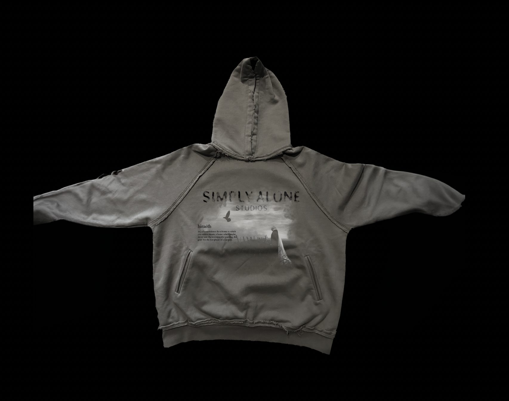
Fig. 07 | Grey colourway
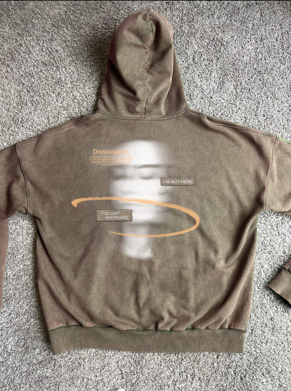
Fig. 08 | Second graphic
Next project
Screen Posters → Alternative poster series | 2024