Work / Alternative poster series
Screen Posters
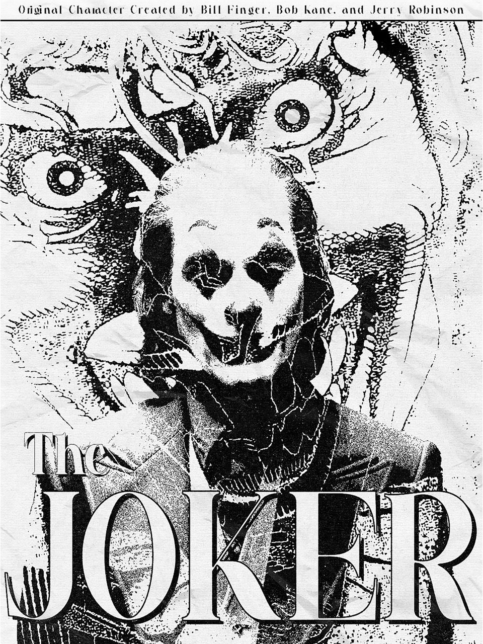
Alternative posters for four titles, all built on one two-colour system.
- Year
- 2024
- Services
- Art direction, Poster design, Typography
- Deliverables
- Four posters at 18x24 and 20x30
Where the music posters are deliberately unalike, these run to a single set of rules: two inks, a coarse halftone, a panel grid, and a synopsis justified across the foot.
Holding every title to the same structure moves the work into the edit - which frames get chosen, how the panels are weighted against each other, and where the title block is allowed to break the grid it sits in.
The halftone is set coarse on purpose. At poster size the dot is visible from a normal viewing distance, which keeps the source footage reading as print rather than as a screenshot.
Self-initiated. Unofficial poster studies made as personal work. They are not affiliated with, licensed by, or endorsed by the rights holders of the titles shown.
“Two inks and one grid, so the differences land in the edit.”
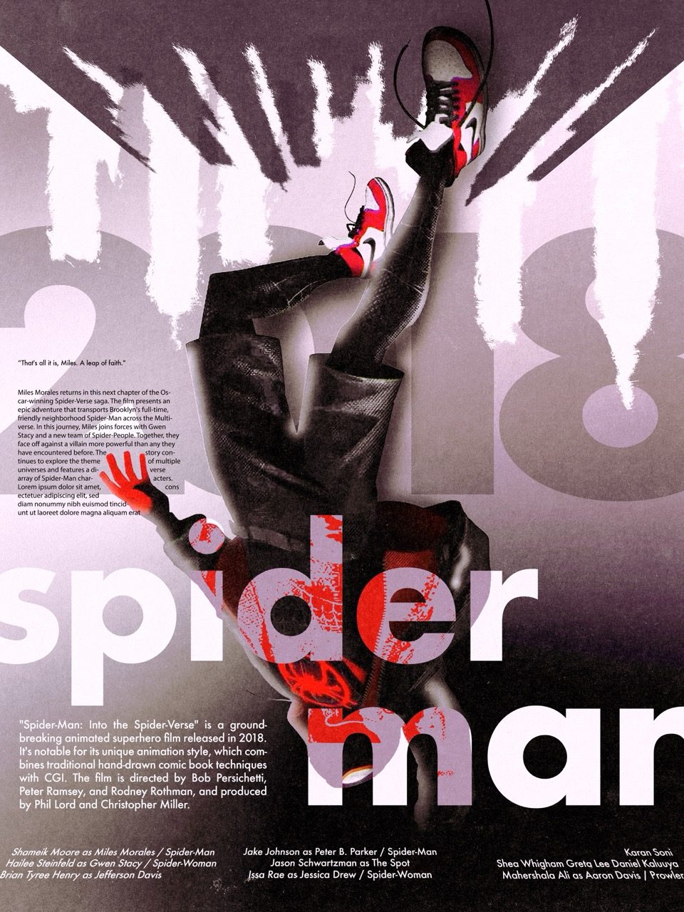
Fig. 01 | 18x24
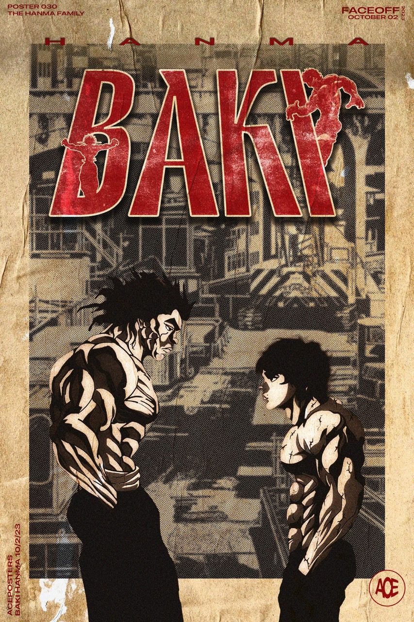
Fig. 02 | 20x30
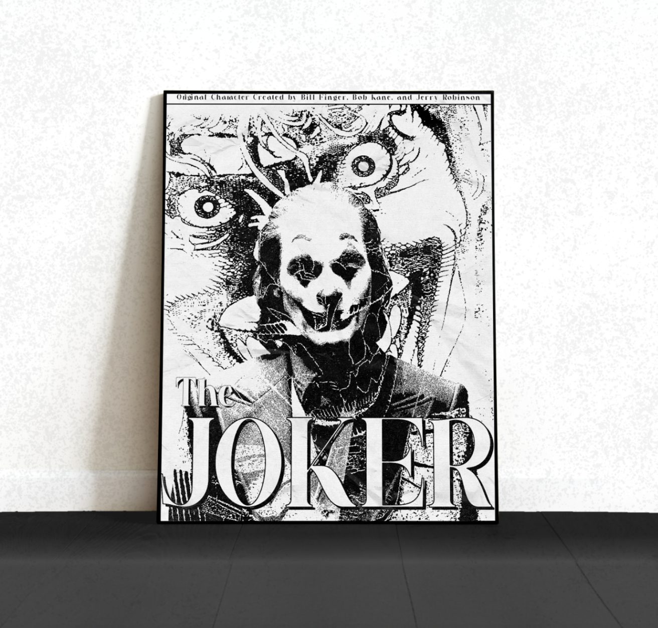
Fig. 03 | Framed
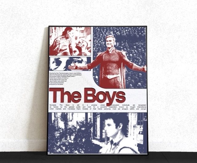
Fig. 04 | Framed
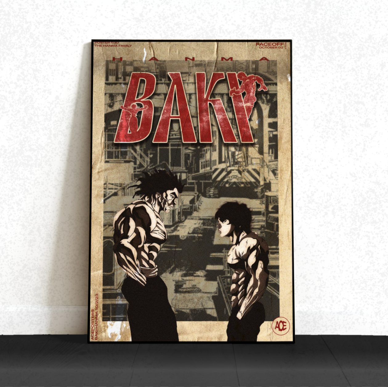
Fig. 05 | Framed
Next project
Rhinestone Cowboy → Tee graphics | 2024