Work / Covers & packaging
Album Art
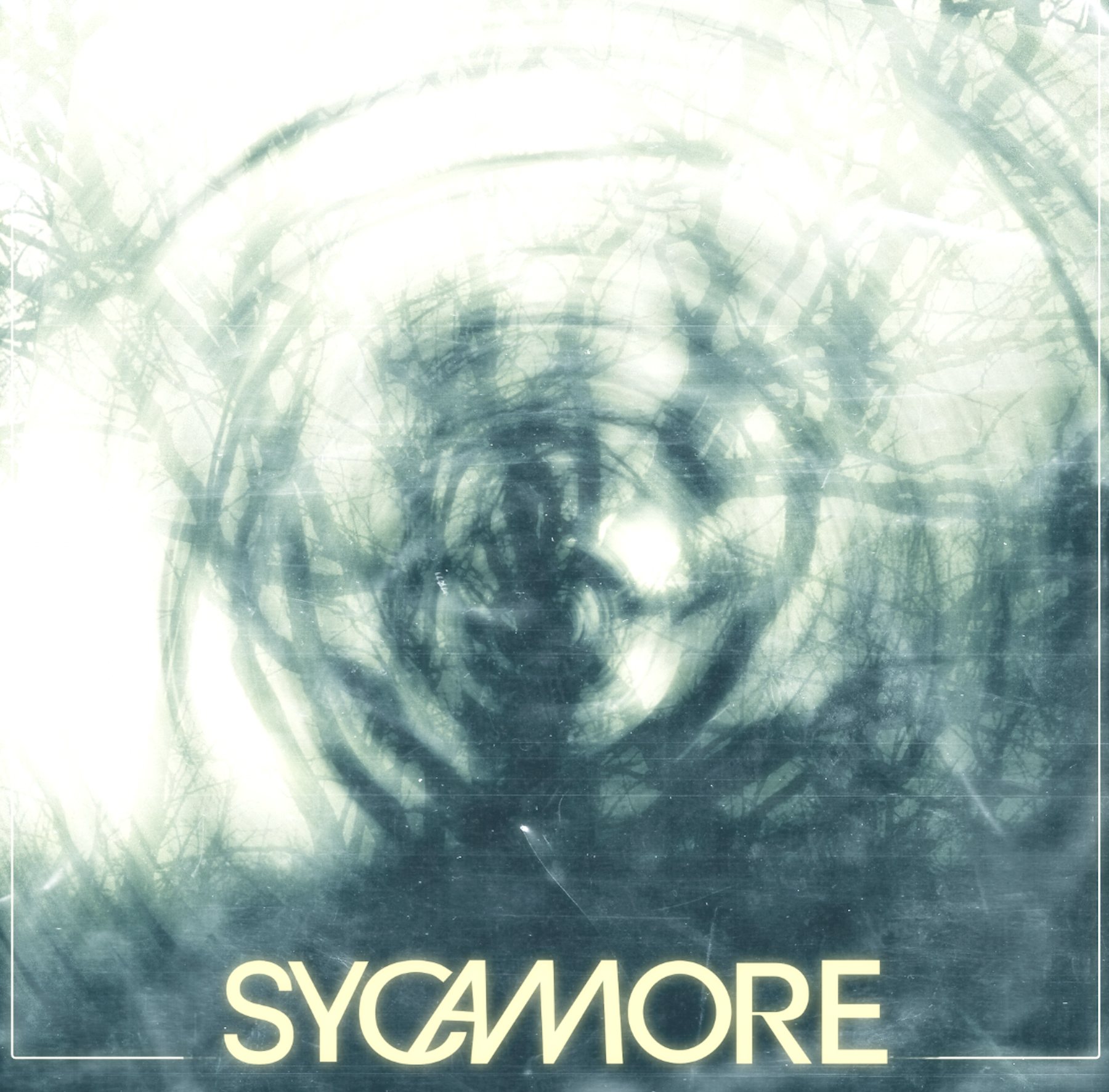
Covers built to survive being shrunk to a thumbnail without losing what they are.
- Year
- 2024
- Services
- Art direction, Cover design, Typography
- Deliverables
- Six covers, one release in situ
A cover now lives at two sizes that could not be further apart: a 3000px master and a postage stamp in a streaming queue. Everything here is designed at the small size first and then allowed to reward the large one.
That means one dominant shape per cover - a swirl, a rose, a single insect on goldenrod - with the wordmark either cut into it or held well clear, never competing at thumbnail size. The Sycamore wordmark stays fixed across the run so the releases read as a set in a discography list.
Texture does the rest. Scanned grain, sleeve creases and heavy contrast give each one a physical read that a clean digital render would not have.
The Sycamore covers are in release, which is the only real test of the thumbnail-first argument: they have to hold up in a row next to everything else an artist has put out.
“Designed at thumbnail size first, then allowed to reward the large one.”
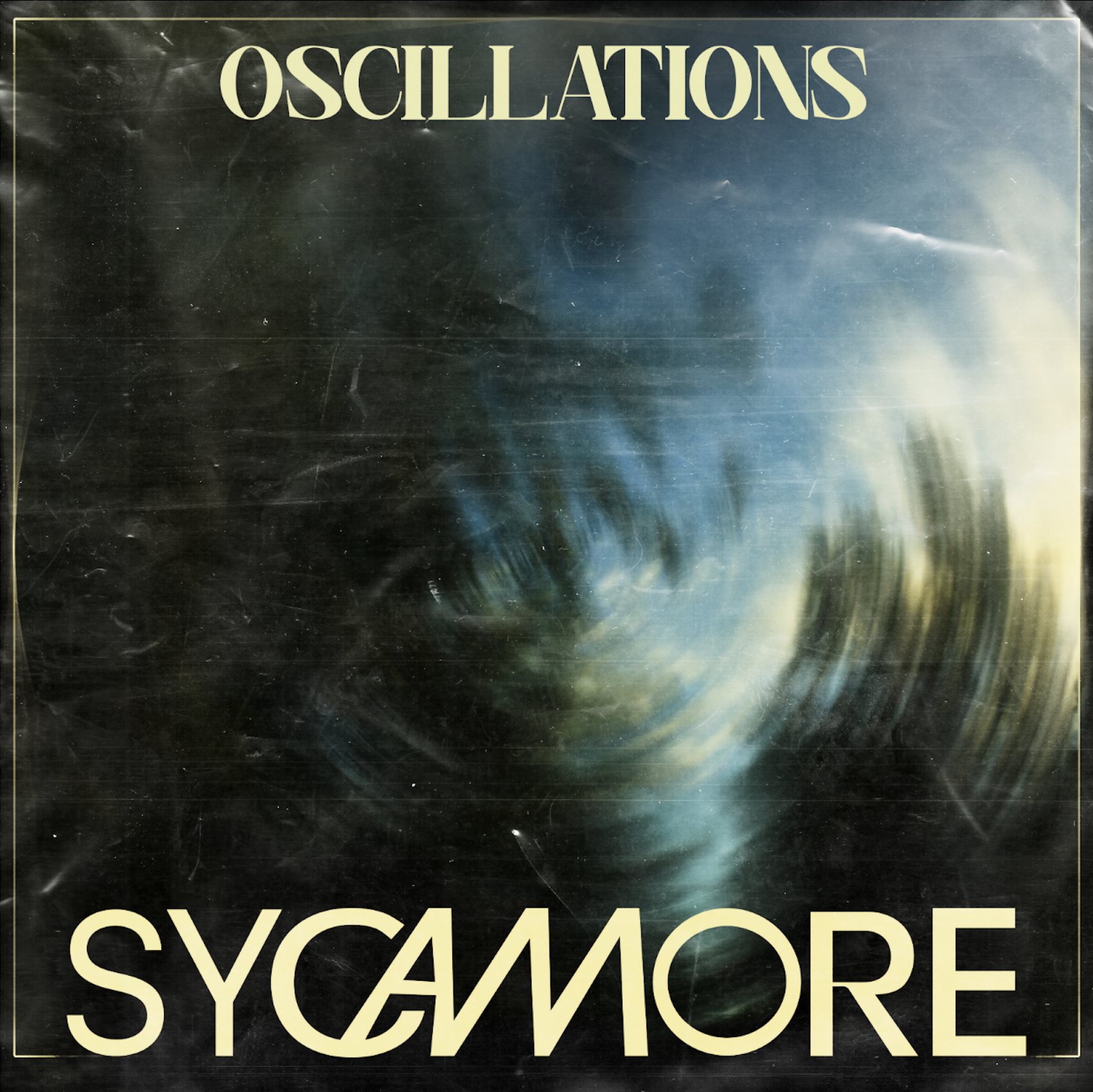
Fig. 01 | Oscillations
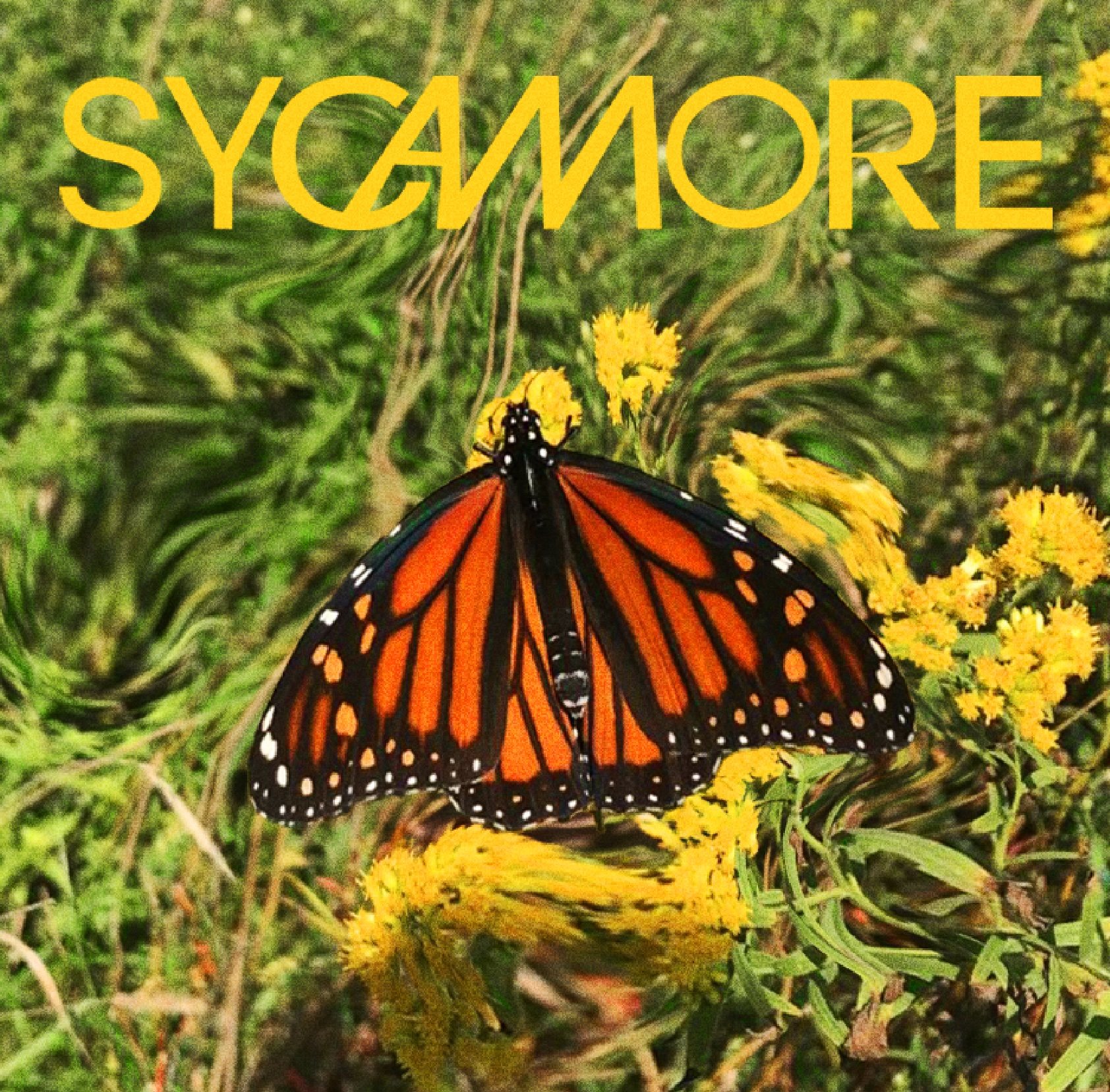
Fig. 02 | Nowadays, single
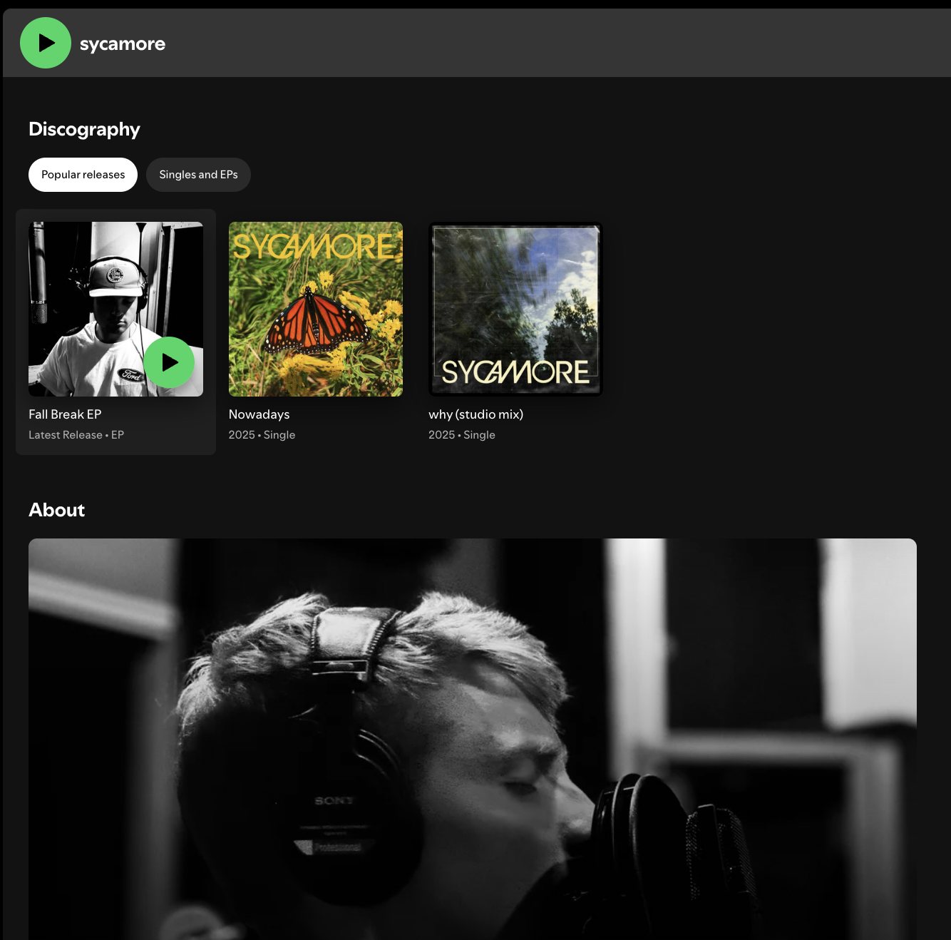
Fig. 03 | In release

Fig. 04 | Cover
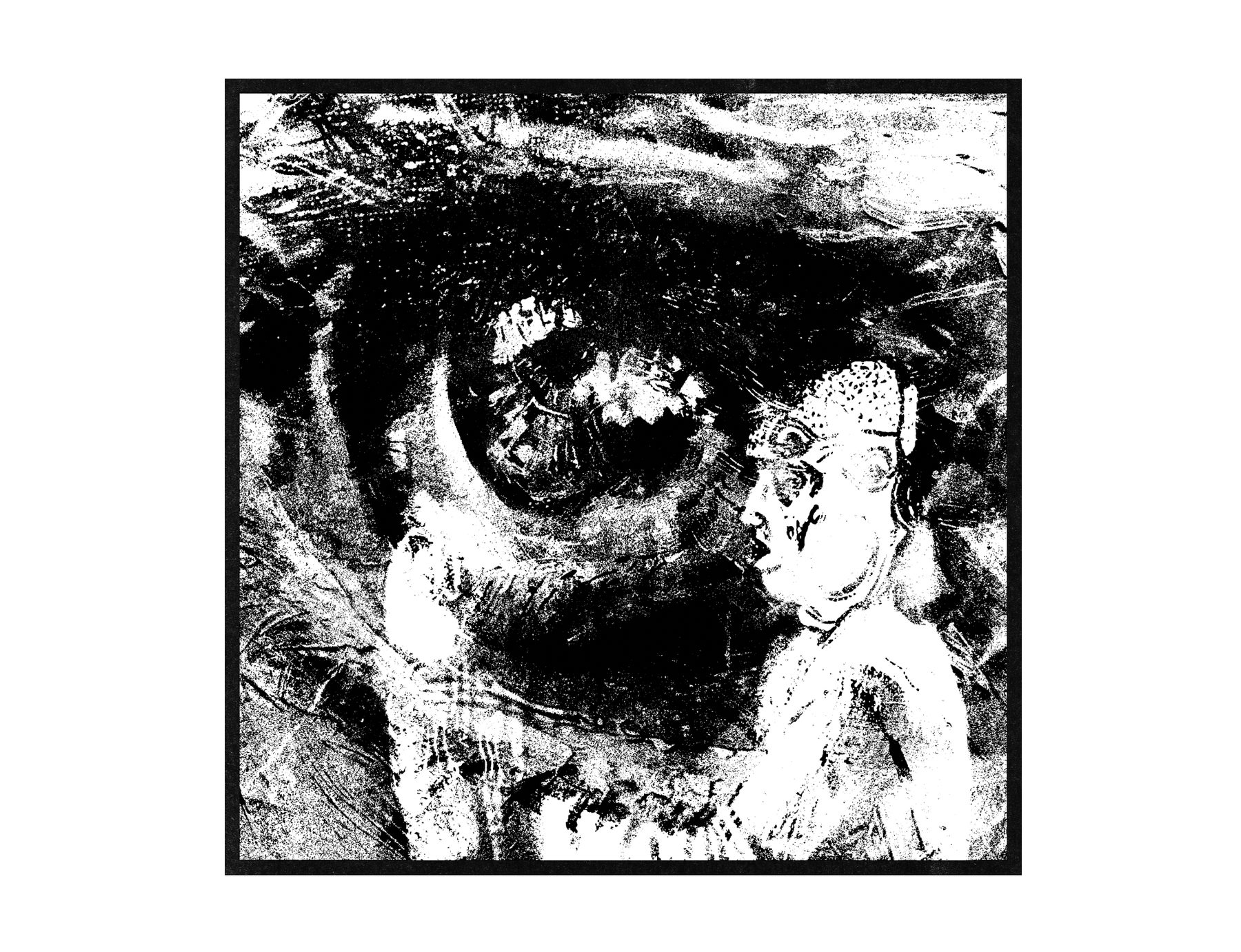
Fig. 05 | High-contrast cover
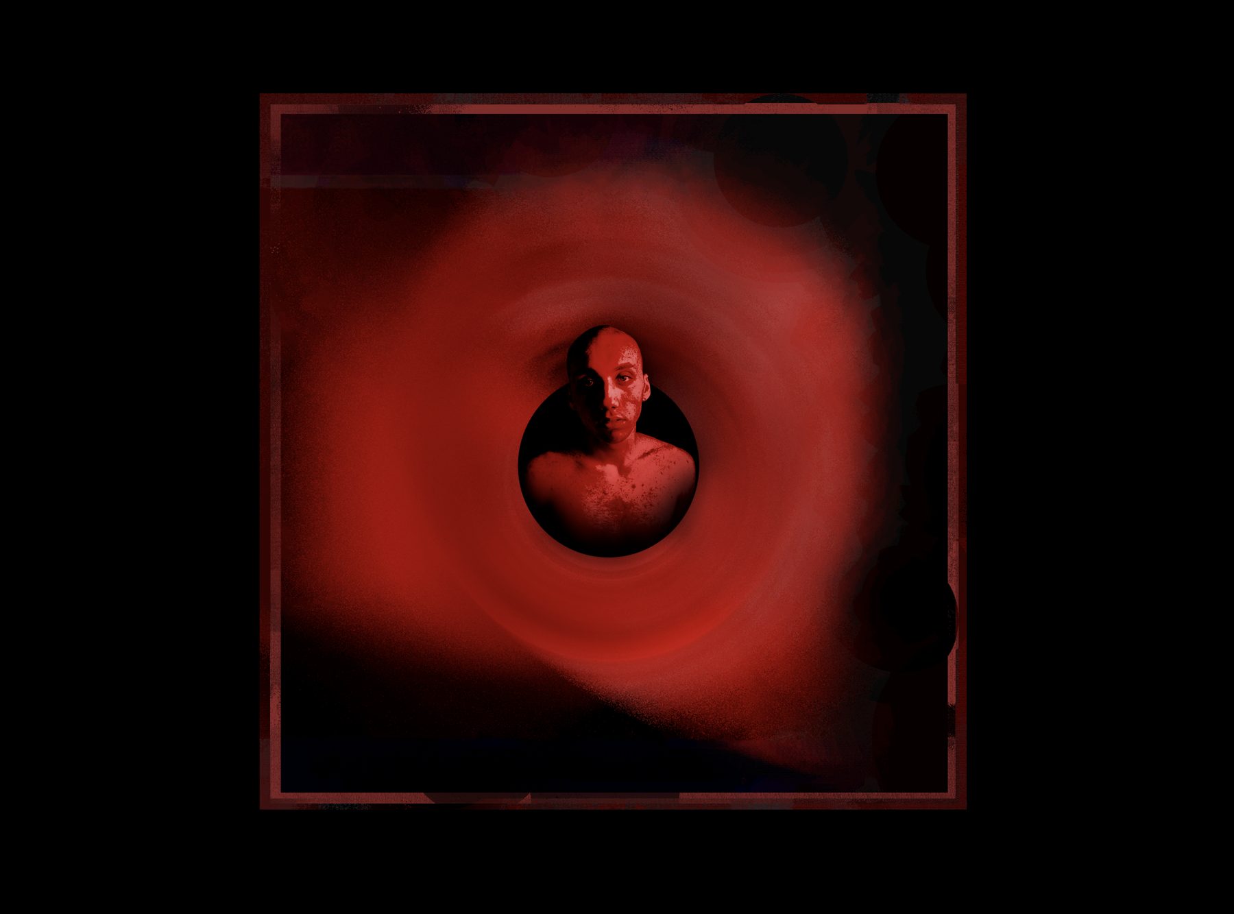
Fig. 06 | Cover
Next project
Lacuna → Streetwear graphics | 2023